Coconut Kenny’s
Client Overview
- Coconut Kenny's is island-themed, family-friendly restaurant chain based in Western Washington.
Industry
- Food Service
Services
- Branding
- Package Design
- Visual Design
Situation
In the spring of 2019, I was approached by ownership from Coconut Kenny’s about their brand. At the time they had 6 locations across northwest Washington, but were looking to expand further south. They understood that if they wanted to eventually franchise Coconut Kenny’s they needed to have a more robust, more cohesive visual identity system. As we talked I began to ask them questions about their brand and who their main audience was. While they had definite opinions about what they thought – there was no system in place to help corroborate this information.
Task
In order to build a strong visual foundation from which they could build their brand – we need to make sure we had a strong understanding of who they are. In order to do this, we wanted to first gain some data /insight into what the brand was – then we wanted to build some language around that information, and give them a voice. Finally, we wanted to use that information to build a strong library of visual assets to support their brand.
Action
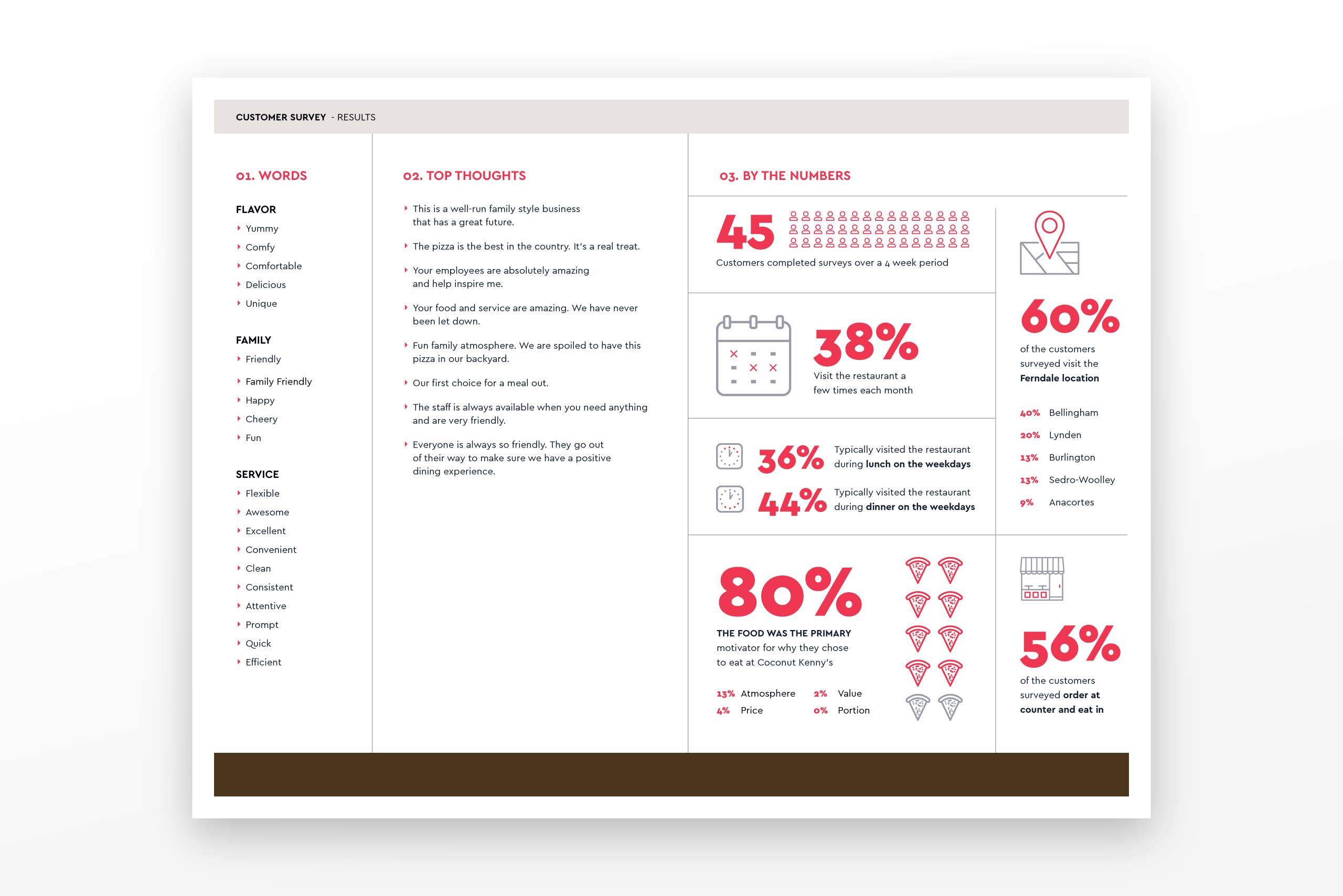
To do this we set up a series of interviews. We identified 4 specific groups of people we felt would give us some strong insight into the attributes of Coconut Kenny’s and who was their key audience. These 4 groups were: ownership, managers, line staff and finally, we developed a survey to poll the customers themselves.
Results
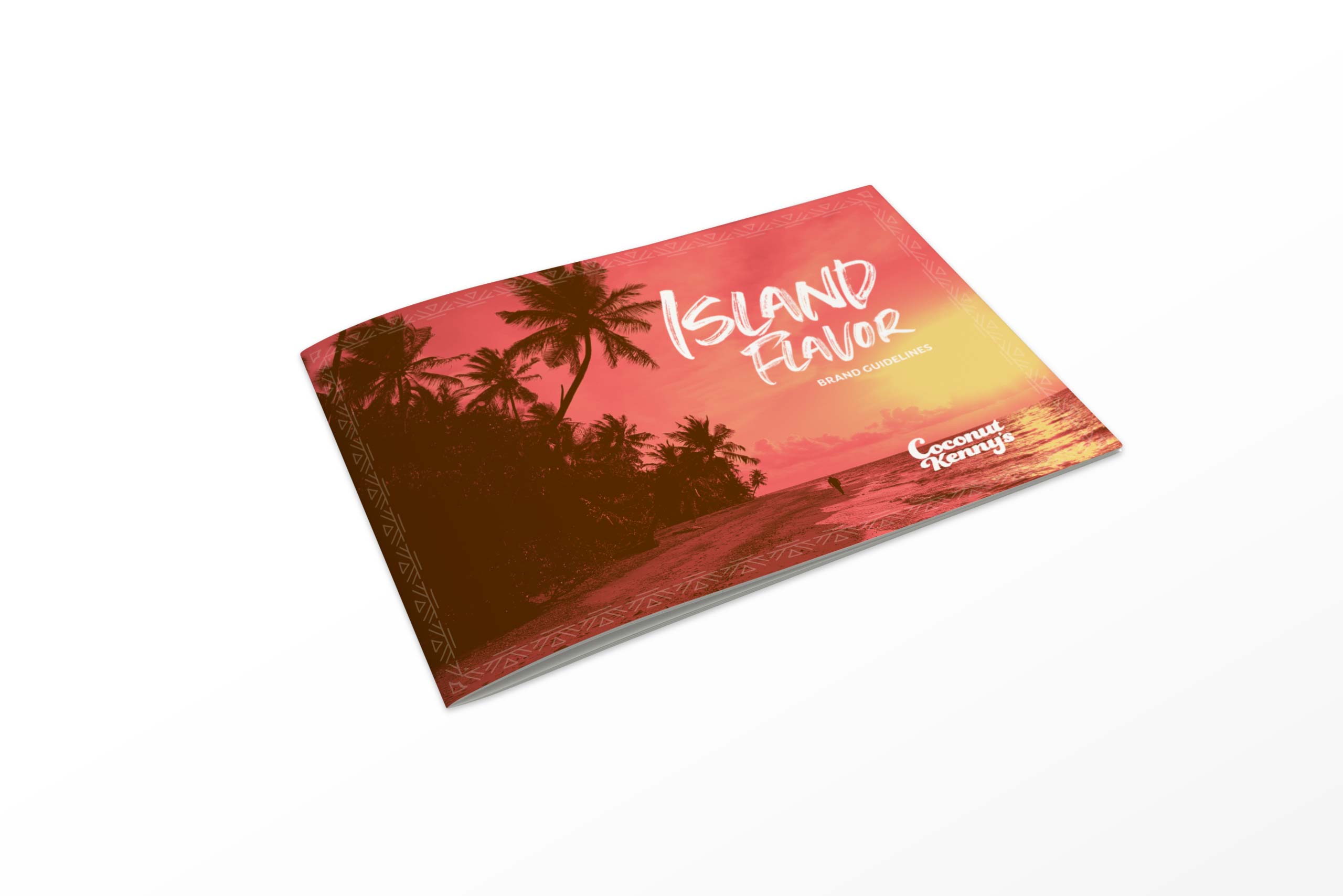
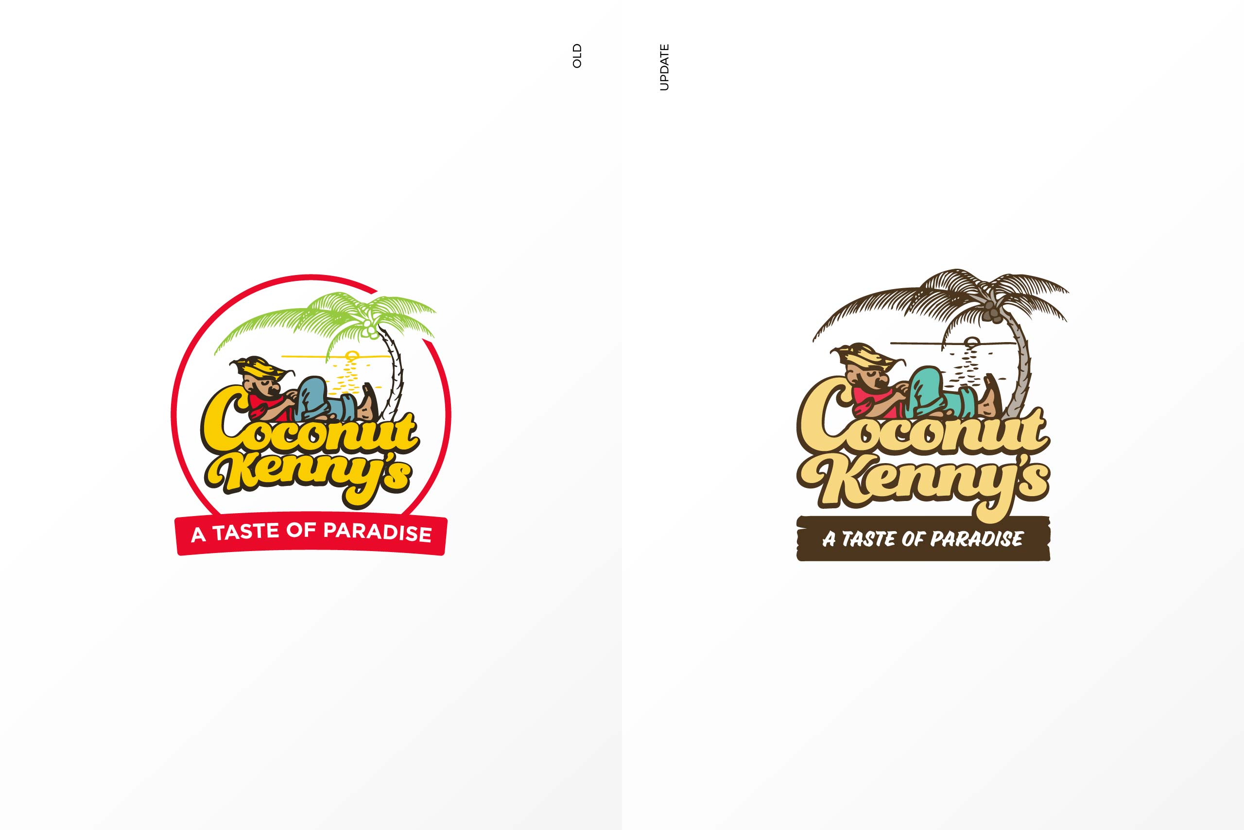
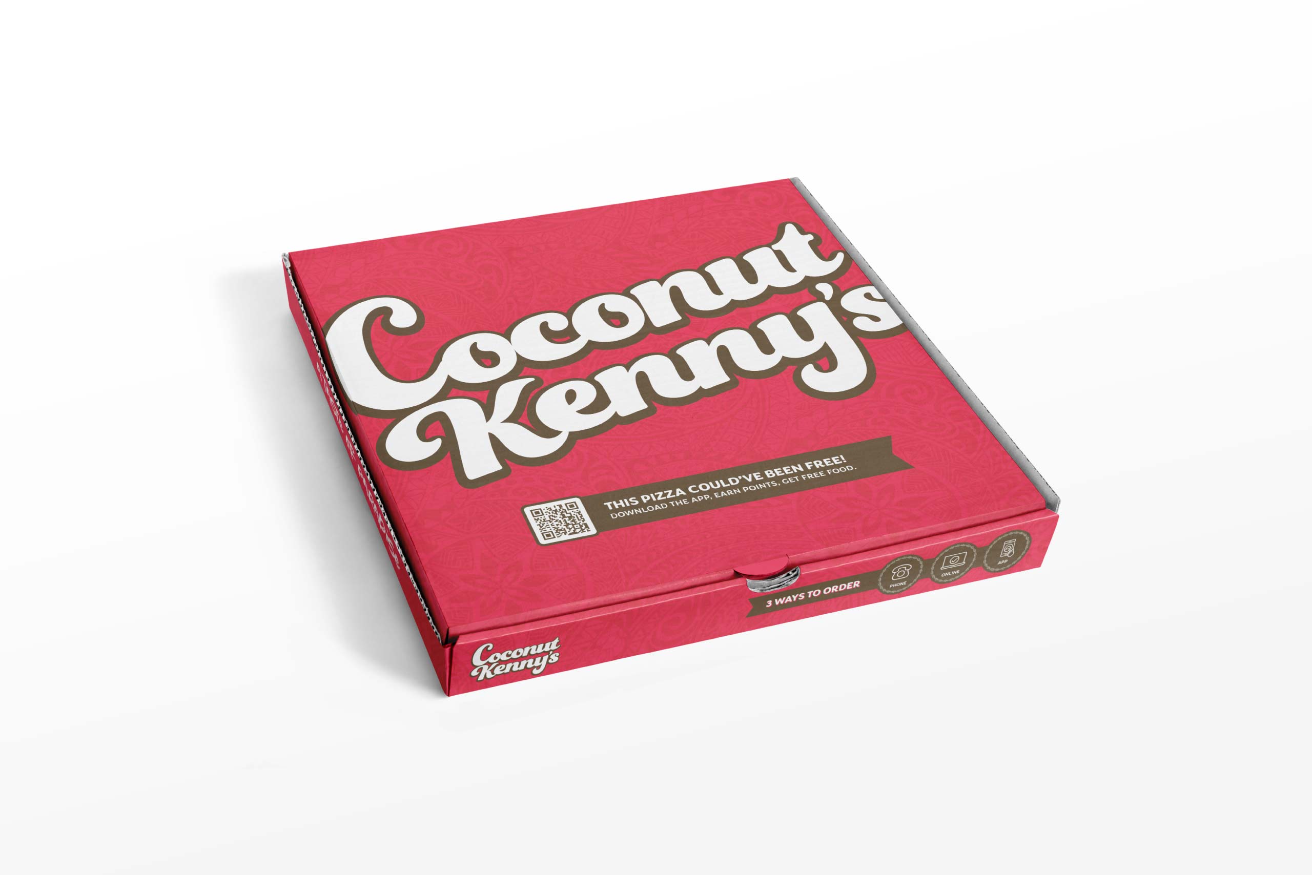
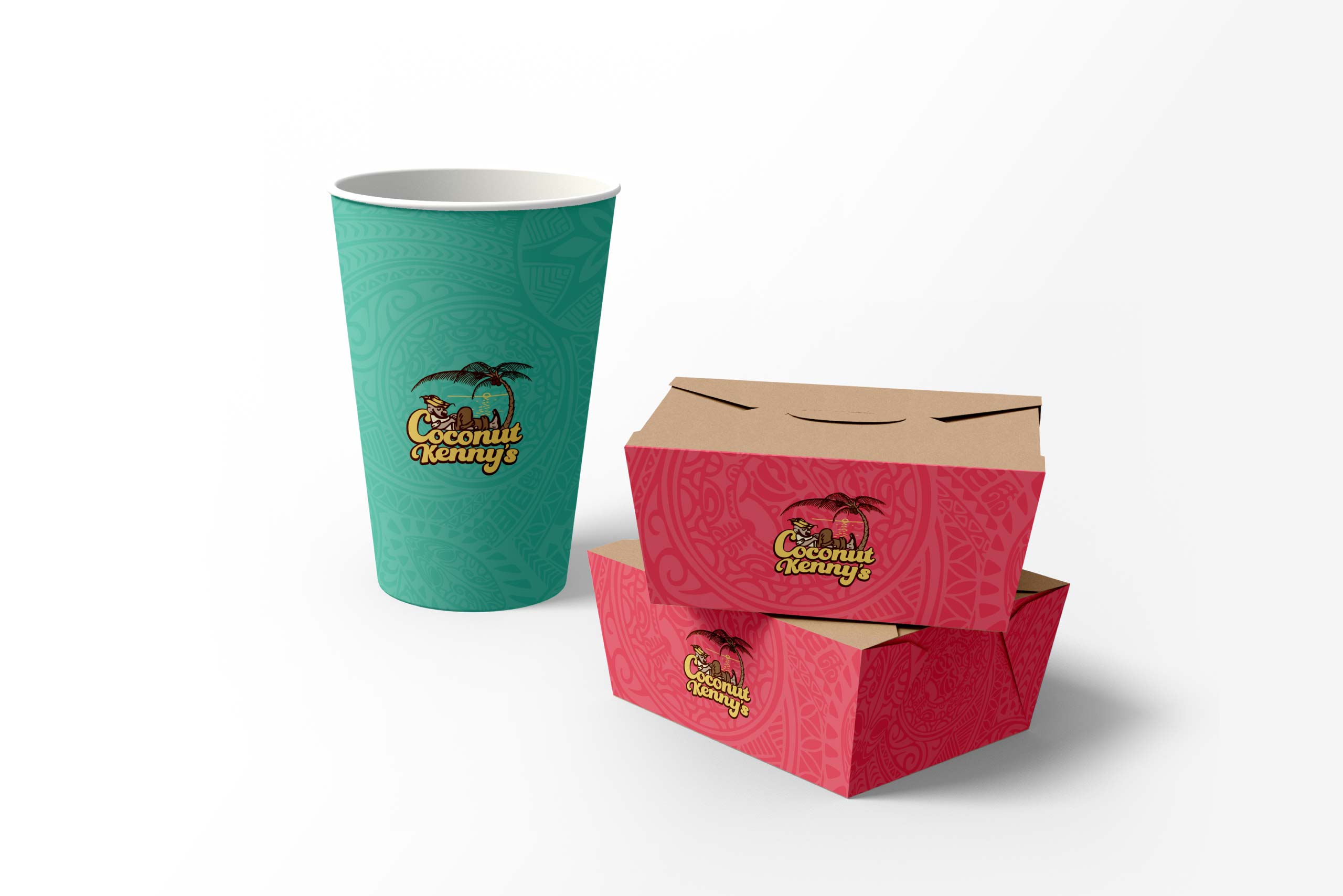
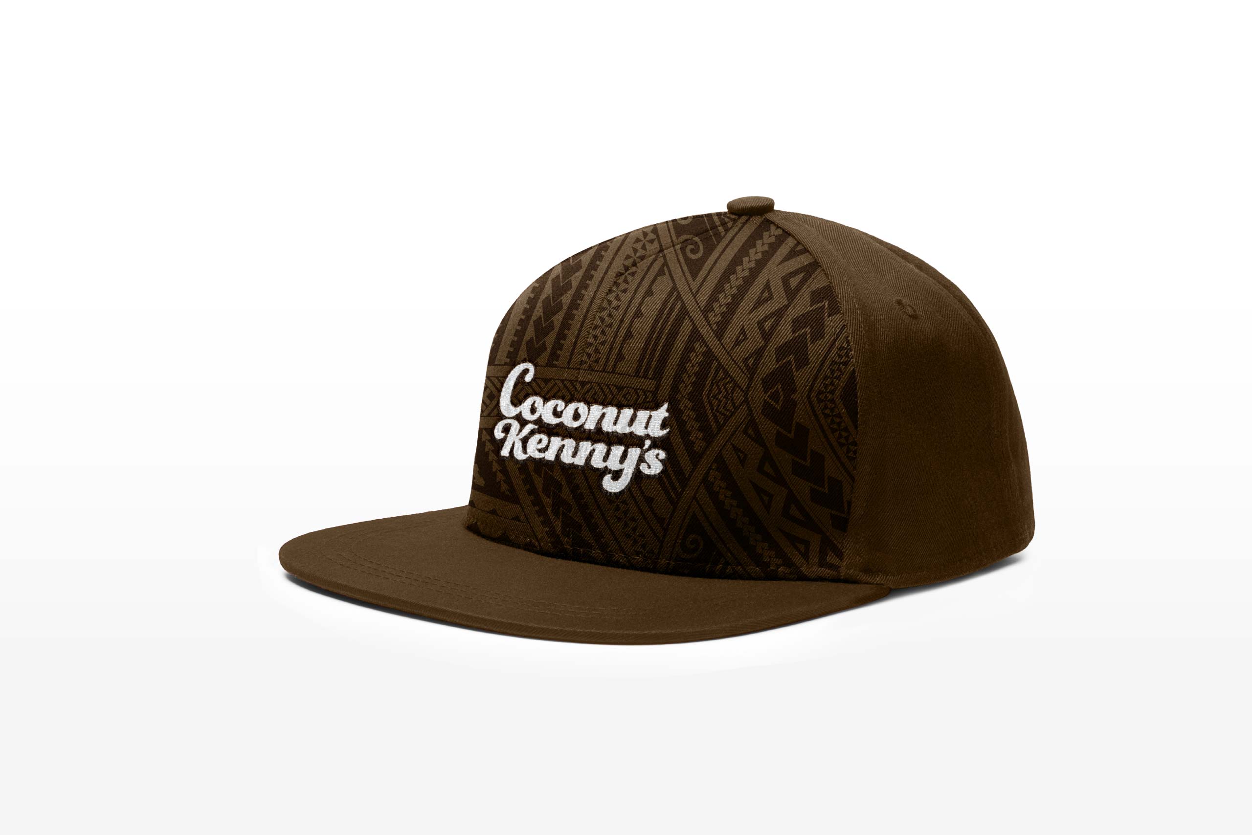
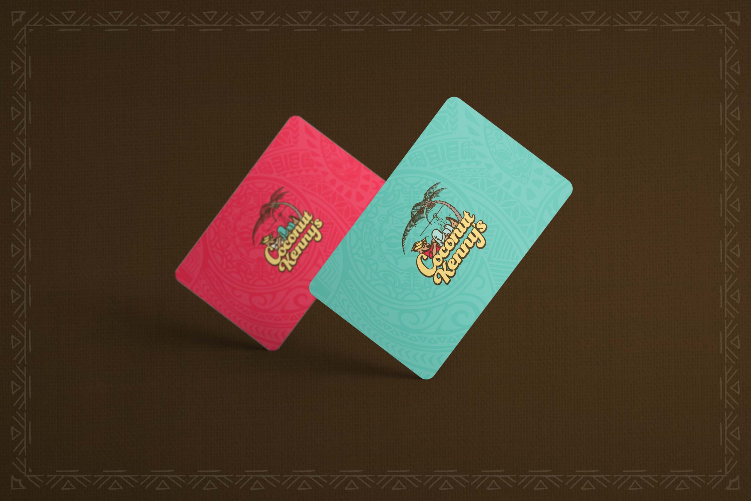
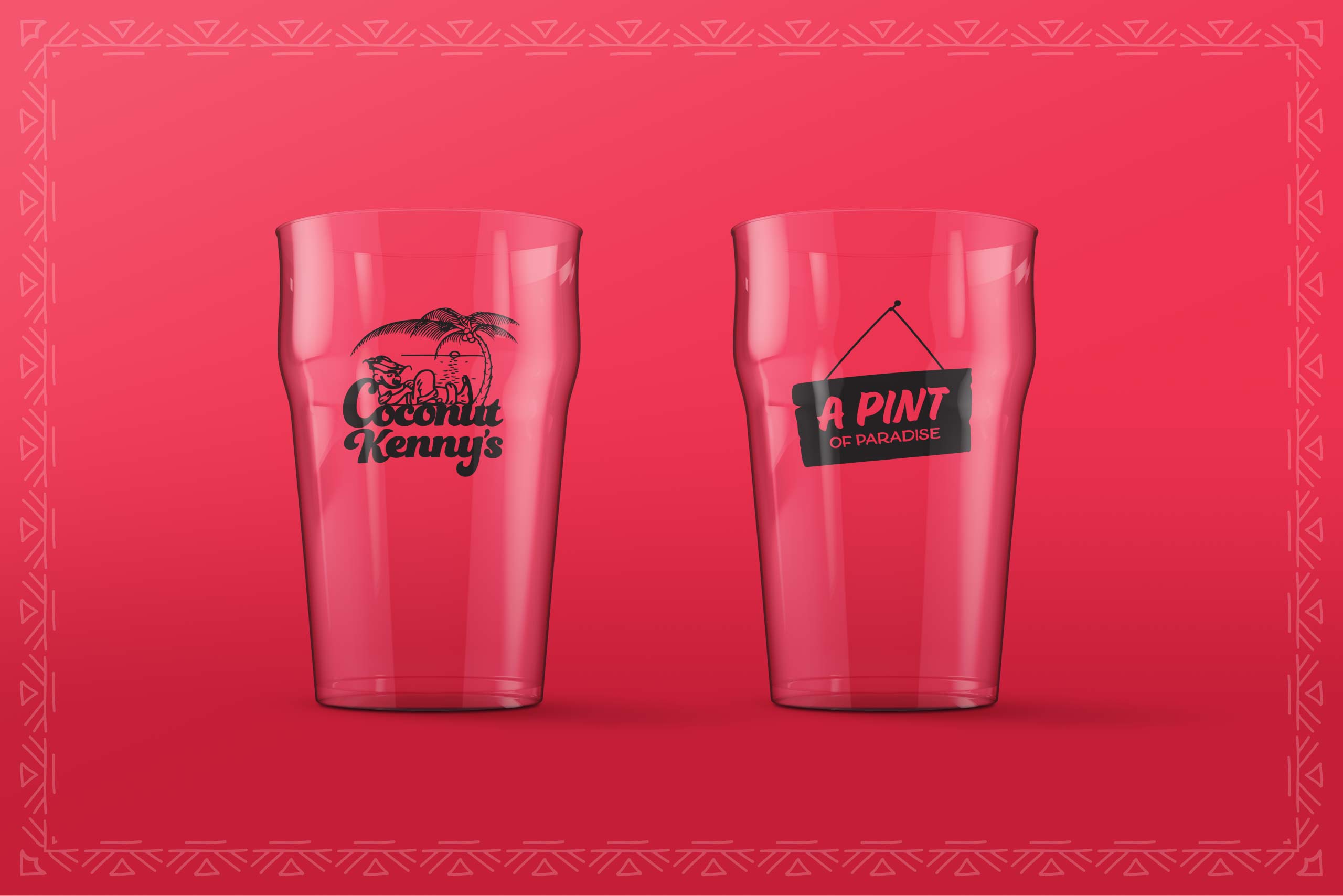
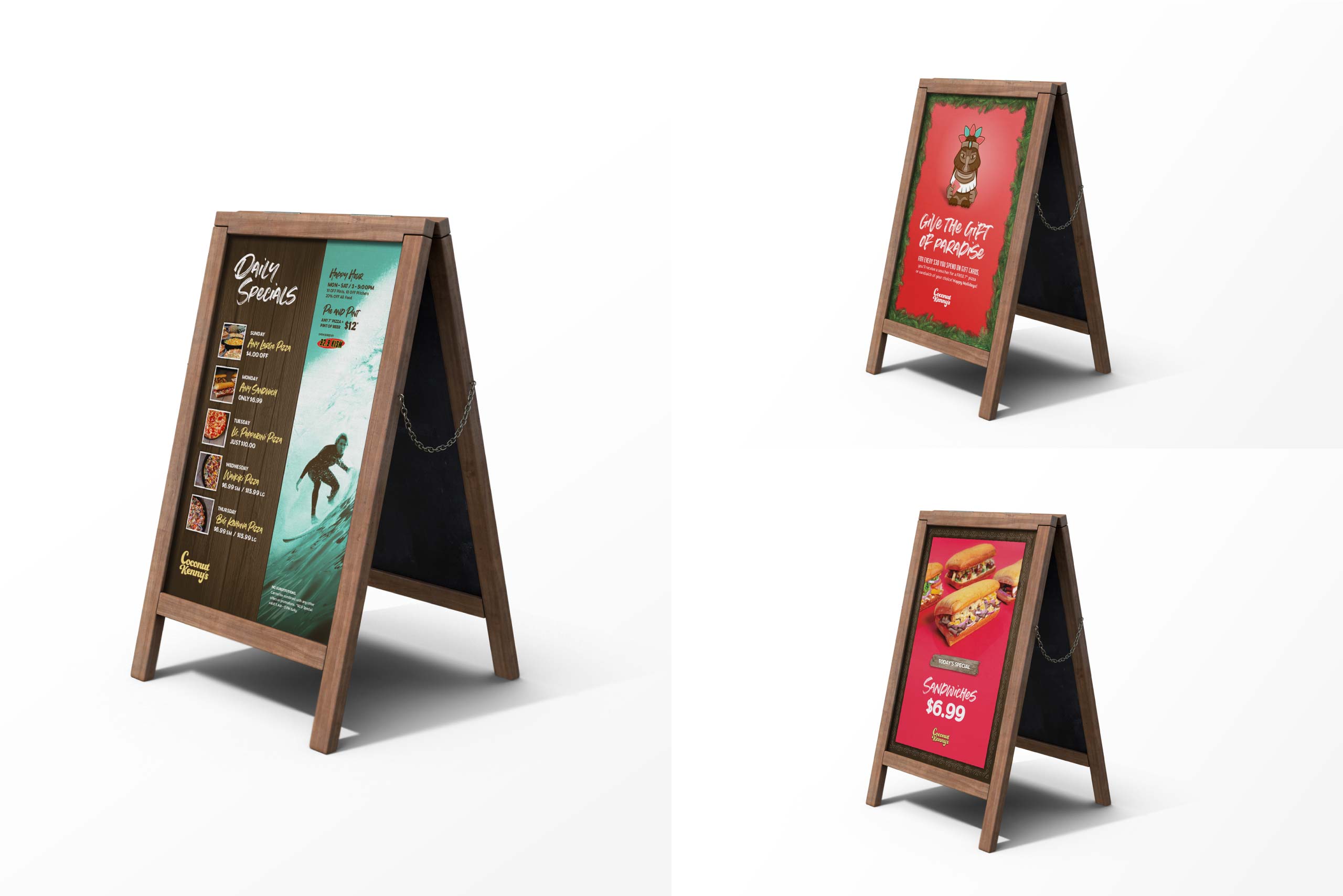
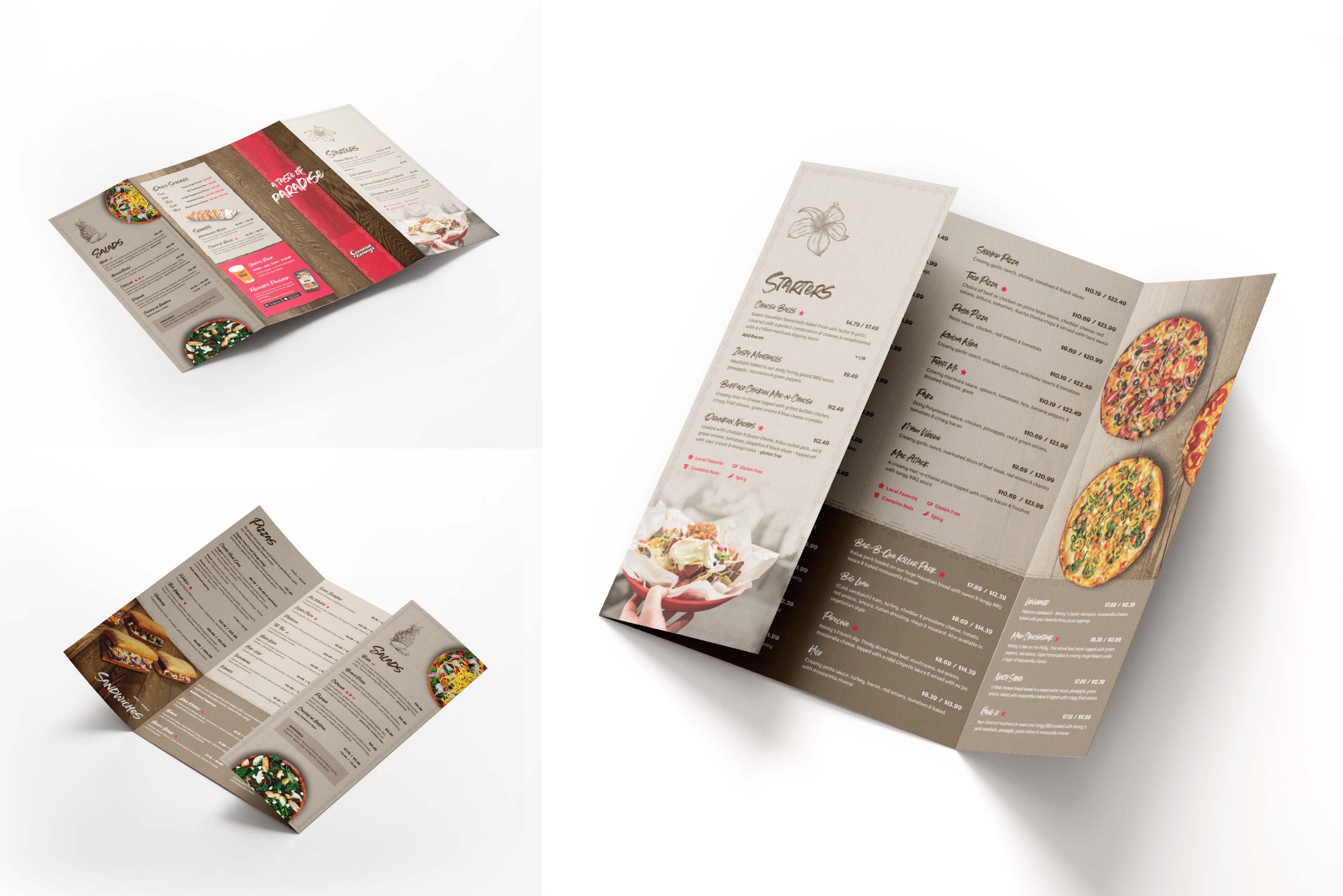
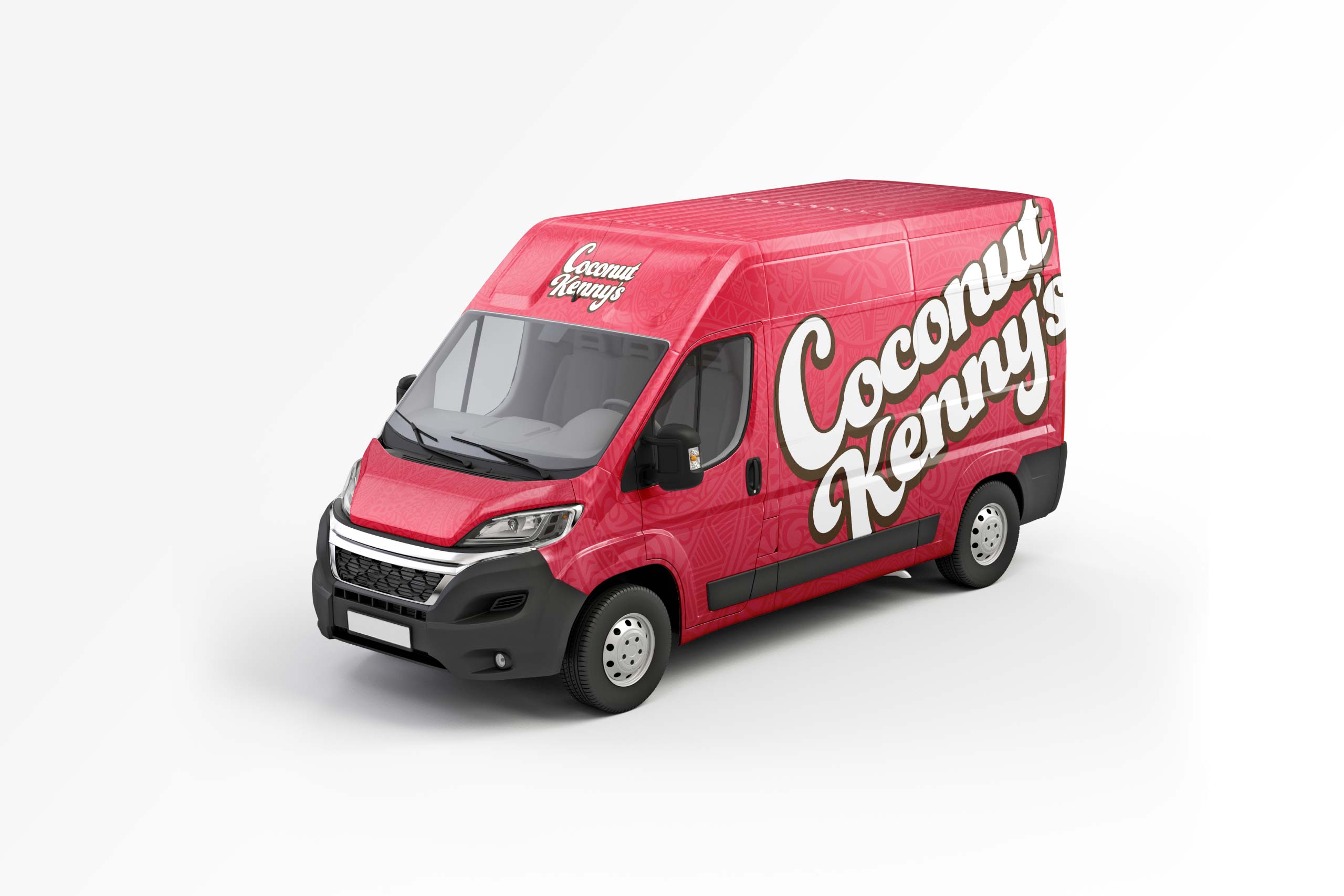
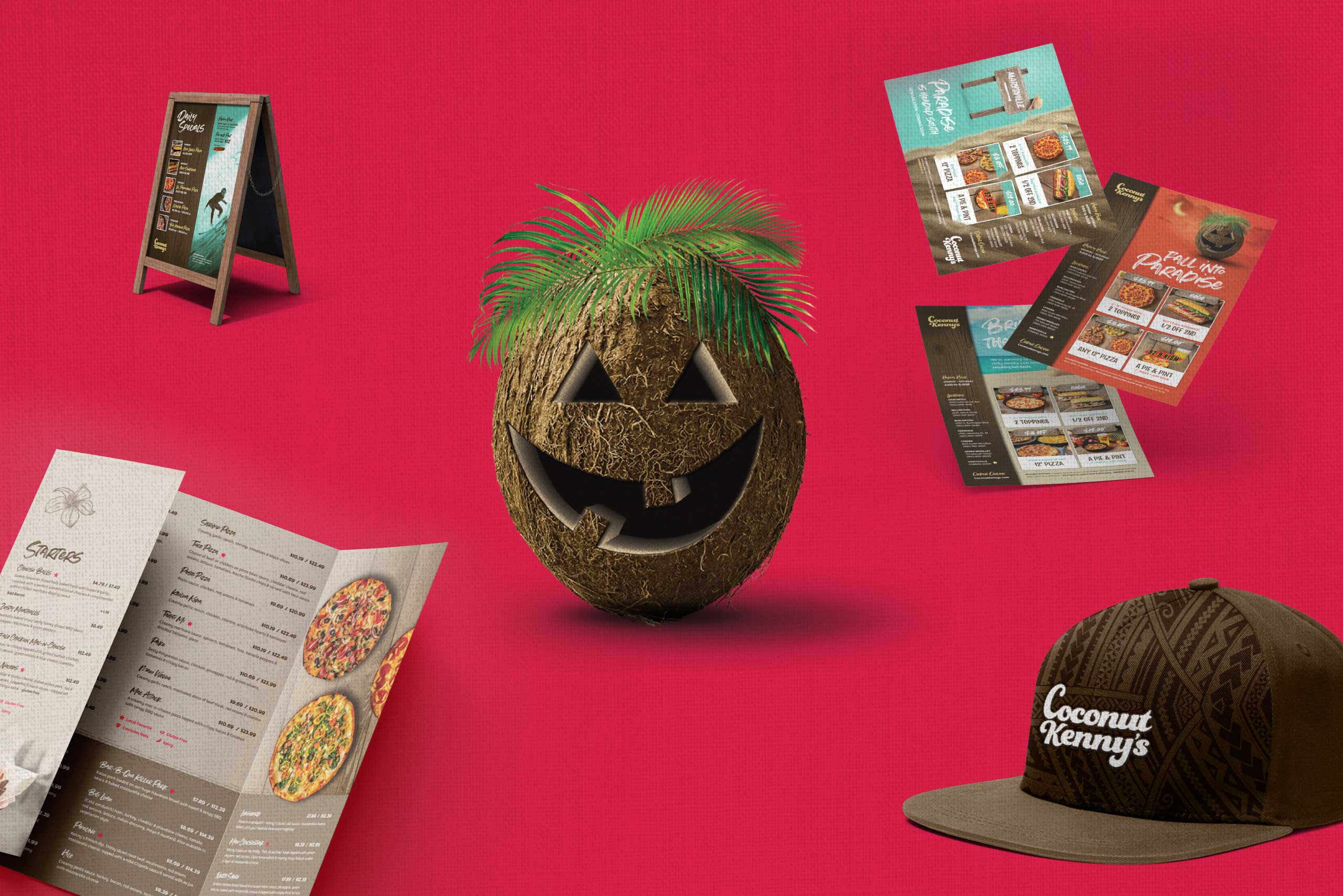
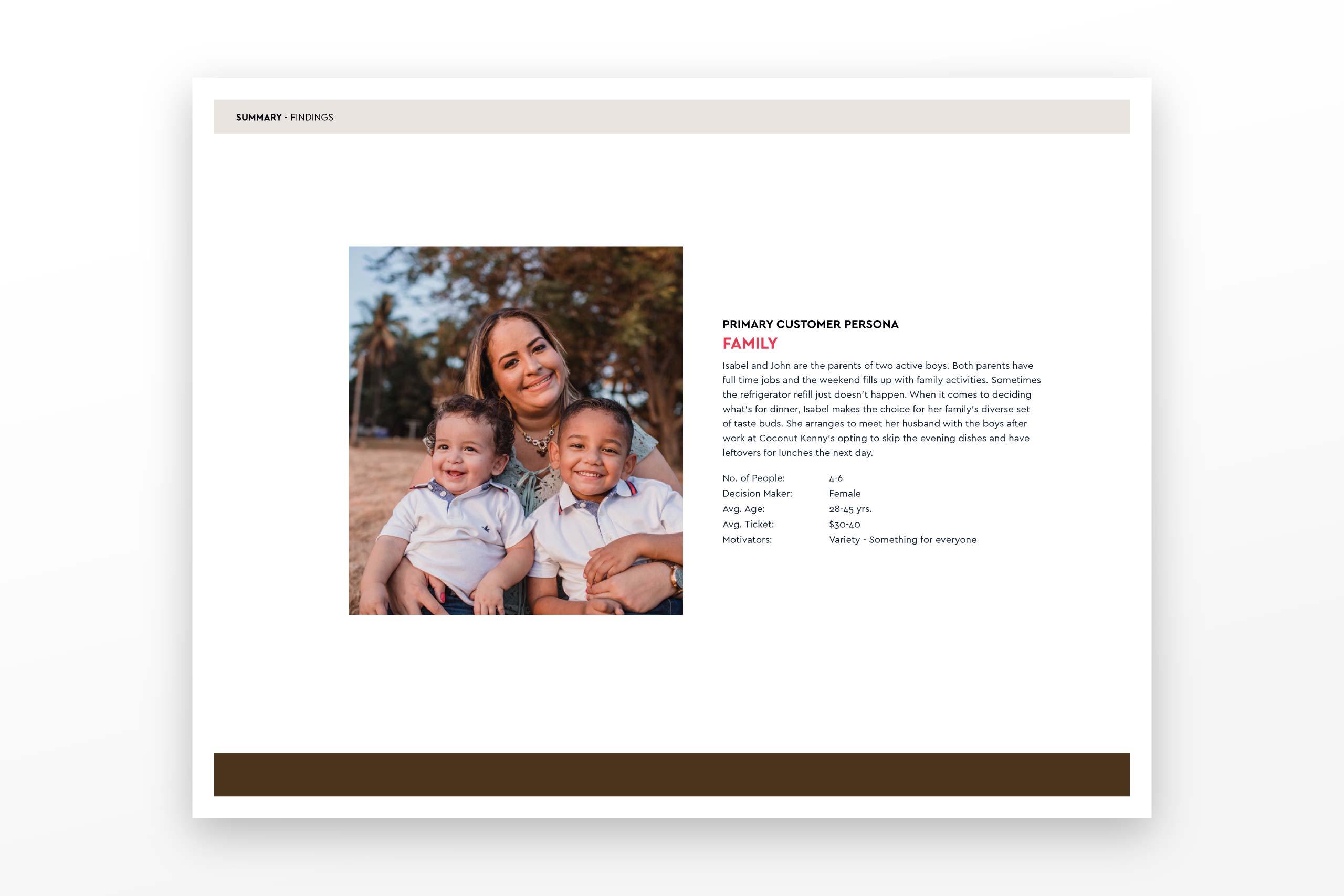
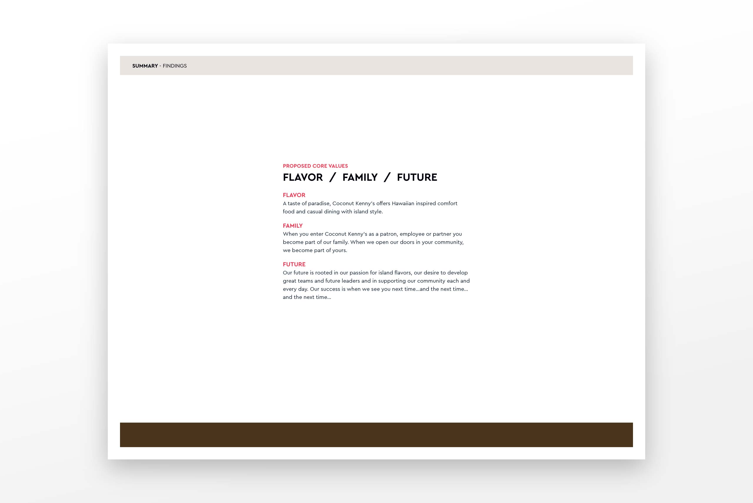
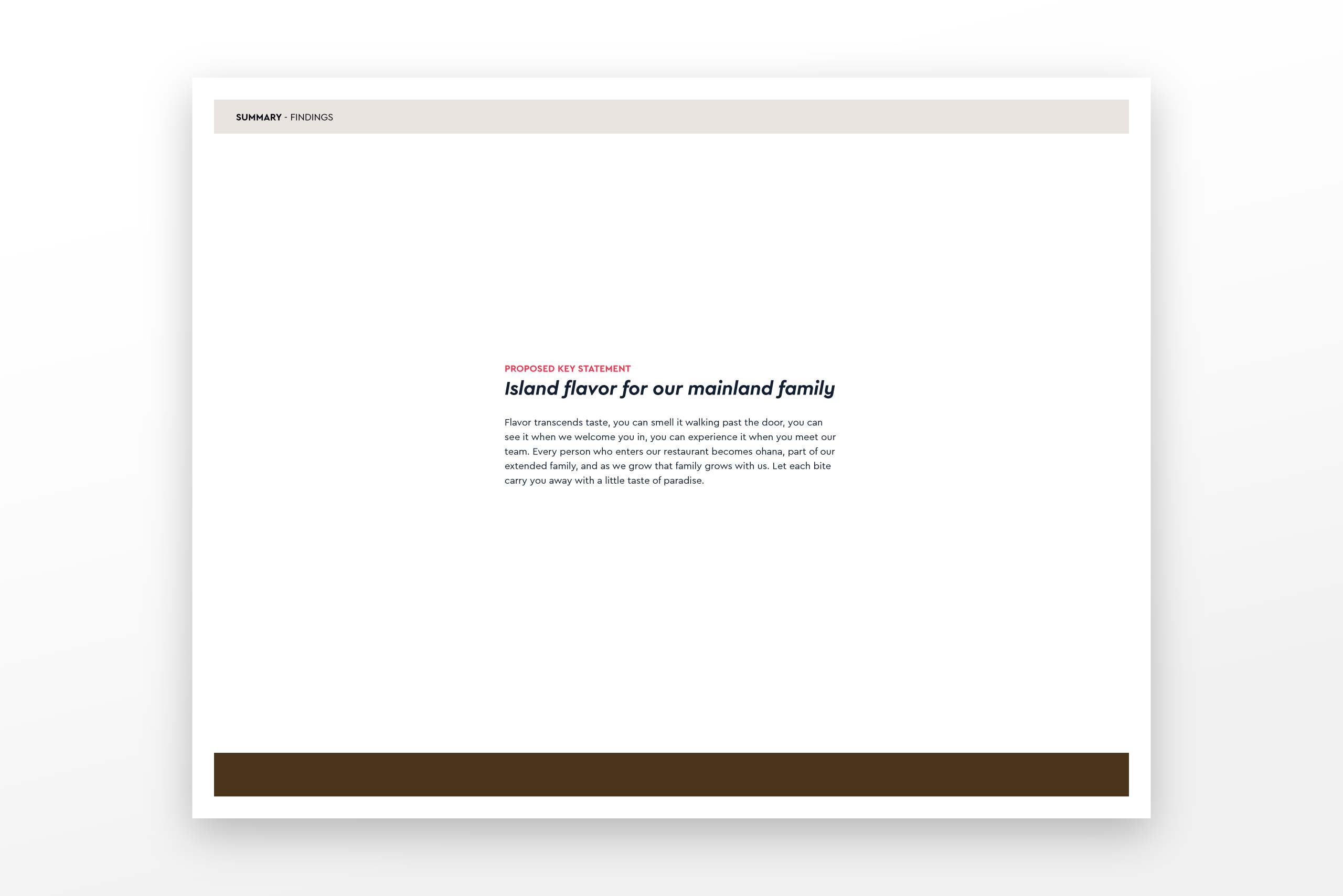
What we learned from our interviews and surveys was that Families of 4 to 6 individuals, were overwhelming the main audience that was attracted to Coconut Kenny’s brand. Female family members were also identified as being the decision-makers regarding where the family should eat. Using this knowledge we worked collaboratively with ownership to craft 3 brand attributes they could use to communicate the brand to existing and potential staff and customers. They are Flavor / Family / Future. (The definition of these attributes is included in the visuals below). We then created from these attributes a value proposition and key statement. From there we used our findings to help guide our decision-making in updating their visual collateral. We updated started with their color palette and then applied the new palette to their logo – making slight modifications to the typography. Finally, we gave them new updated texture and type choices to reflect this more approachable, friendly, and family-oriented brand.